
Having a background in photography, I probably have a bit of an advantage when it comes to dashboard design. I am regularly brought in to define, or redefine, the end-user experience, and that often includes a dashboard. The redefine is often an unfortunate result of the users drifting away from BI and going back to the bad old ways.
There are multiple reasons for this, but sometimes it comes down to the way the data is presented to them. Dashboards are an excellent tool to bring the key performance indicators to the surface in an at-a-glance compelling user experience, but often they are designed in a way that makes it cumbersome, awkward, and difficult to see the big picture. I see 'bad' dashboards all the time, some quite cringe-worthy, and I close my eyes and do the 'instant makeover' in my head. Sad, I know, but presenting a compelling user experience is my passion, and it's so easy to get it all horribly wrong.
There are some simple rules to help get it right:
- Keep it Simple - yes, really simple. The dashboard should tell us if we are up, down, the same, in trouble, doing amazing, on top of the world, about to crash and burn. Honestly, we don't need all the detail. Clutter can hide the little sweet spots of info that we need to make decisions.
- Interactive - why use a BI tool if you are just doing something you could do in Powerpoint? If the user sees something interesting they will likely want to know more. If they point at something to get more, they will likely be happy. If they must call someone, open another tool, do some elaborate calculations in Excel etc., then the dashboard was really no more useful than a piece of paper. Think - Single Version Of The Truth! - Which makes for a highly awkward to pronounce acronym. SVOTT, we must have SVOTT! Yeah, it doesn't roll off the tongue very well.
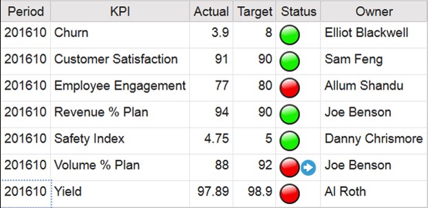
- Show Me the Red! - If the company made $9 million in revenue yesterday afternoon and I don't know if that is a good or bad thing, that is a problem. If you have corporate or operational KPIs, and bad stuff happens if those aren't met (people shouting, crying, flailing, heads rolling - that kind of thing) you need to give them a handy and very obvious hint - a little sprinkling of red - a traffic light will do - it should draw their attention nicely.
- Transparency - most BI tools allow you to have multiple entry points into the dashboard - tabs for example. Use these to logically organize the KPIs and supporting information. I usually have a 'Start of Day' or 'Executive' tab where the most critical KPIs and relevant supporting data are displayed. If we are doing true performance management, we have aligned our entire organization to the corporate objectives, so we can have the strategic corporate KPIs together, and the departmental metrics can further be grouped together in separate tabs.
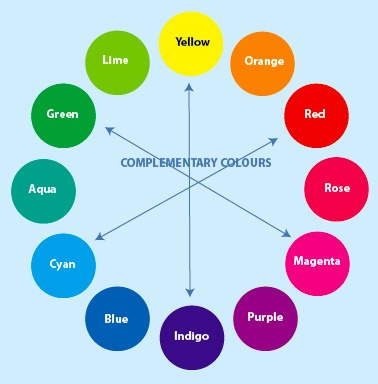
- Color Me Bad - OK, I don't have a massive amount of fashion sense but I do know that when you pile a whole bunch of different colours together, you can end up with something beautiful, or something that, when mixed up together will create the new colour - confusion. It is easy to spot trends and proportional distribution when my eyes are not fighting to extinguish the visual conflict generated by throwing the bright purple between the lime green and hot pink on that pie chart (we'll talk about pie charts another time. I hate them. I have my reasons, and I am not asking you to hate them too, but, really, I despise them). And "puce." The name even sounds gross. Don't use puce. It doesn't go with anything - except more puce. Choose a theme and stick with it - choose colours from the same or complementary family. We will get into that in another article. And above all - try really hard not to use red unless it means "bad."
